务必下载!!
今日的代码和讲义 以及思维导图:【点击此链接下载 Day06.zip】
大纲
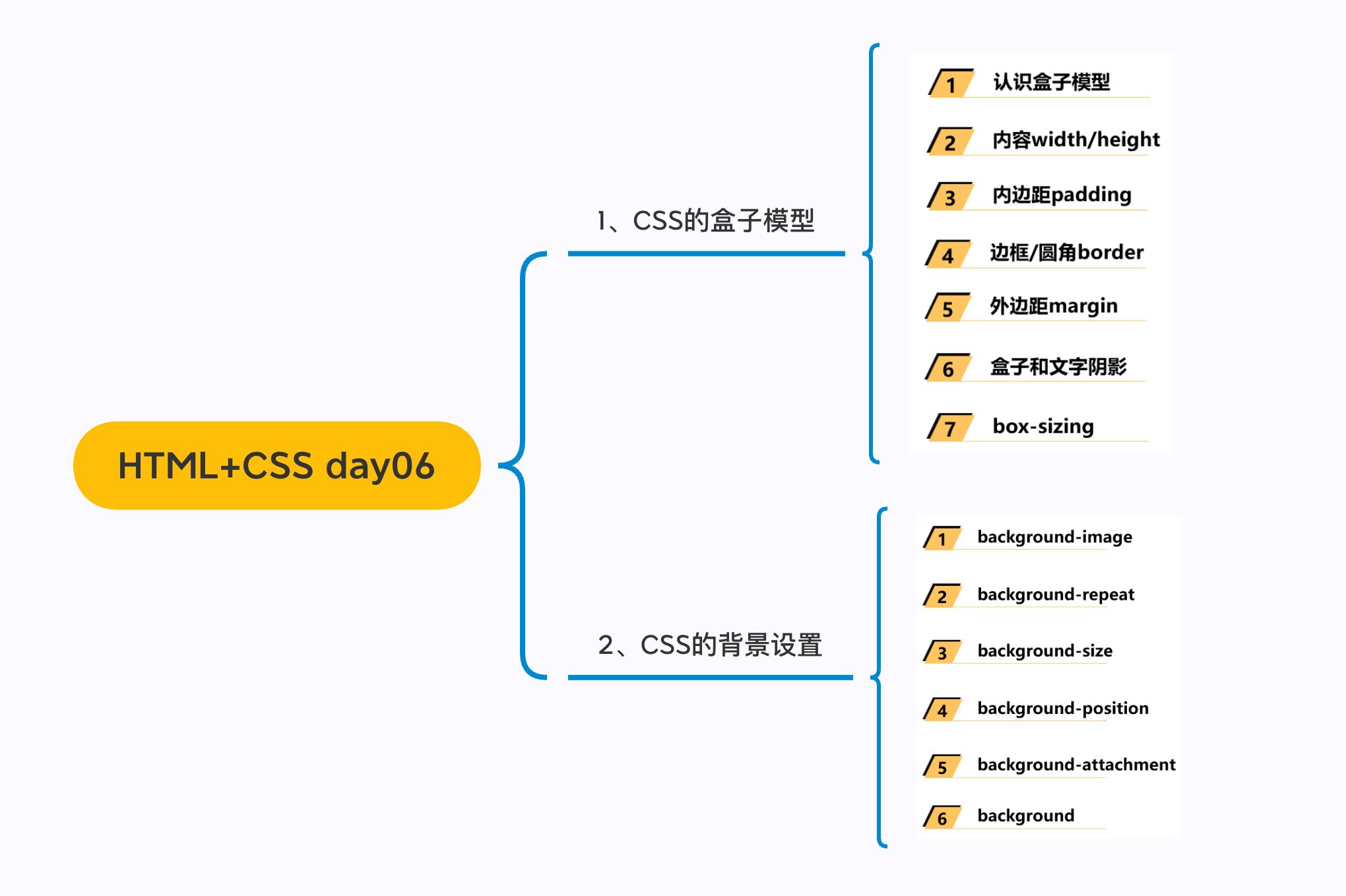
一. 盒子模型
1.1. margin
1 | |
外边距 - margin
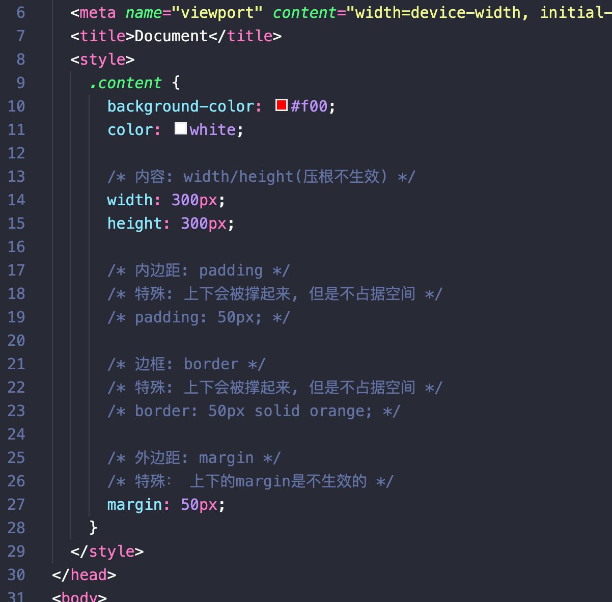
margin属性用于设置盒子的外边距,通常用于元素和元素之间的间距;margin包括四个方向,所以有如下的取值:margin-top:上内边距margin-right:右内边距margin-bottom:下内边距margin-left:左内边距
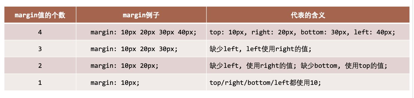
margin单独编写是一个缩写属性:margin-top、margin-right、margin-bottom、margin-left的简写属性margin缩写属性是从零点钟方向开始, 沿着顺时针转动的, 也就是上右下左;
margin也并非必须是四个值, 也可以有其他值;
margin 的其他值
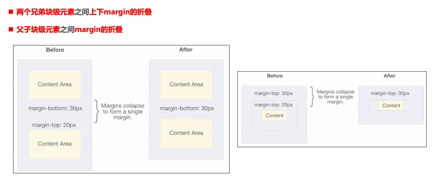
上下 margin 的传递
margin-top传递- 如果块级元素的顶部线和父元素的顶部线重叠,那么这个块级元素的
margin-top值会传递给父元素
- 如果块级元素的顶部线和父元素的顶部线重叠,那么这个块级元素的
margin-bottom传递- 如果块级元素的底部线和父元素的底部线重写,并且父元素的高度是
auto,那么这个块级元素的margin-bottom值会传递给父元素
- 如果块级元素的底部线和父元素的底部线重写,并且父元素的高度是
- 如何防止出现传递问题?
- 给父元素设置
padding-top\padding-bottom - 给父元素设置
border - 触发
BFC: 设置overflow为auto(Block formating context)
- 给父元素设置
- 建议
margin一般是用来设置兄弟元素之间的间距padding一般是用来设置父子元素之间的间距
上下margin的折叠
- 垂直方向上相邻的2个
margin(margin-top、margin-bottom)有可能会合并为1个margin,这种现象叫做collapse(折叠) - 水平方向上的
margin(margin-left、margin-right)永远不会collapse - 折叠后最终值的计算规则
- 两个值进行比较,取较大的值
- 如何防止
margin collapse?- 只设置其中一个元素的
margin
- 只设置其中一个元素的
上下margin折叠的情况
块级元素的居中
- 在一些需求中,需要元素在父元素中水平居中显示(父元素一般都是
块级元素、inline-block) - 行内级元素(包括
inline-block元素)- 水平居中:在父元素中设置
text-align: center
- 水平居中:在父元素中设置
- 块级元素
- 水平居中:
margin: 0 auto
- 水平居中:
1.2. outline
1 | |
outline表示元素的外轮廓不占用空间- 默认
显示在border的外面
outline相关属性有outline-width: 外轮廓的宽度outline-style:取值跟border的样式一样,比如solid、dotted等outline-color: 外轮廓的颜色outline:outline-width、outline-style、outline-color的简写属性,跟border用法类似
应用实例
去除a元素、input元素的focus轮廓效果
1.3. box-shadow
1 | |
盒子阴影 – box-shadow
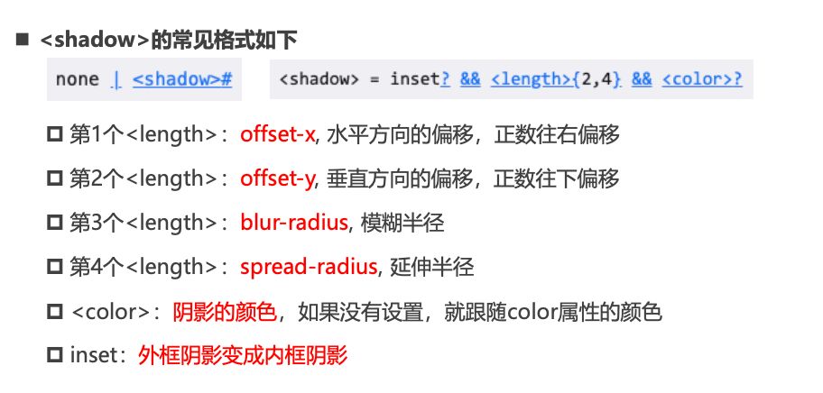
- **box-shadow **属性可以设置一个或者多个阴影
- 每个阴影用
<shadow>表示 - 多个阴影之间用逗号,隔开,从前到后叠加
- 每个阴影用
<shadow>的常见格式如下- 第1个
<length>:offset-x, 水平方向的偏移,正数往右偏移 - 第2个
<length>:offset-y, 垂直方向的偏移,正数往下偏移 - 第3个
<length>:blur-radius, 模糊半径 - 第4个
<length>:spread-radius, 延伸半径
- 第1个
<color>:阴影的颜色,如果没有设置,就跟随color属性的颜色inset:外框阴影变成内框阴影
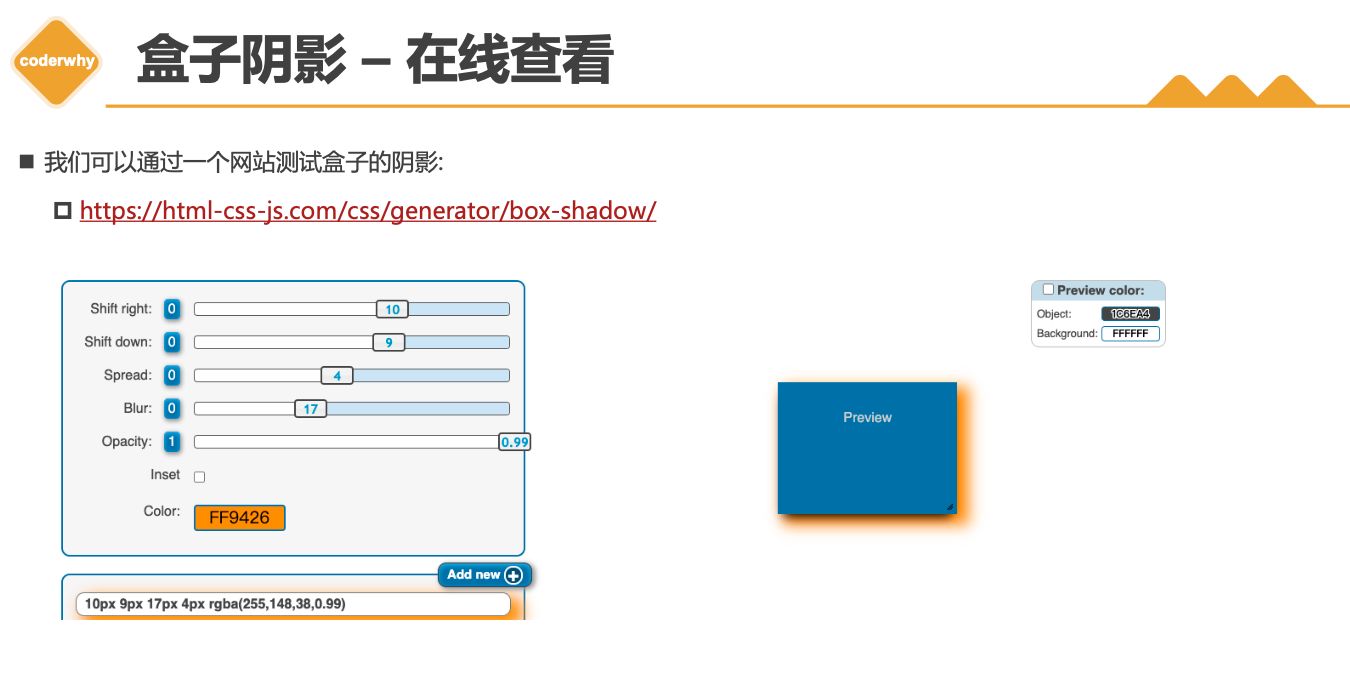
盒子阴影 – 在线查看
- 我们可以通过一个网站测试盒子的阴影:
1.4. text-shadow
1 | |
文字阴影 - text-shadow
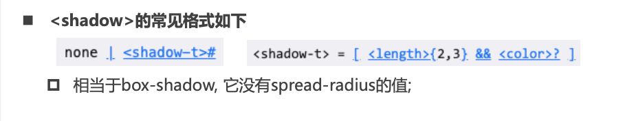
- text-shadow用法类似于
box-shadow,用于给文字添加阴影效果 <shadow>的常见格式如下(没有向内)
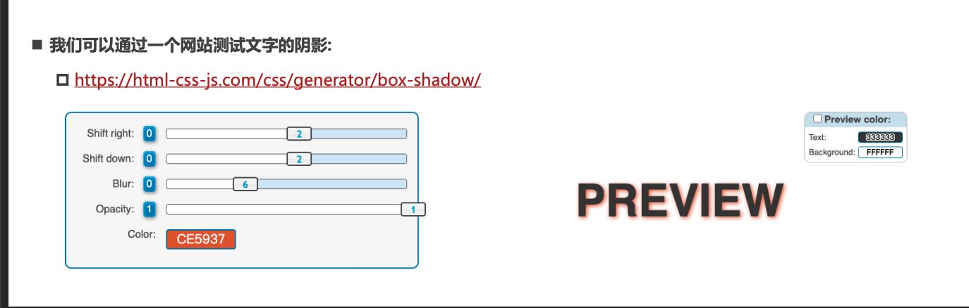
- 我们可以通过一个网站测试文字的阴影:
行内非替换元素的注意事项
- 以下属性对行内级非替换元素不起作用
width、height、margin-top、margin-bottom
- 以下属性对行内级非替换元素的效果比较特殊
padding-top、padding-bottom、上下方向的border
综合案例练习
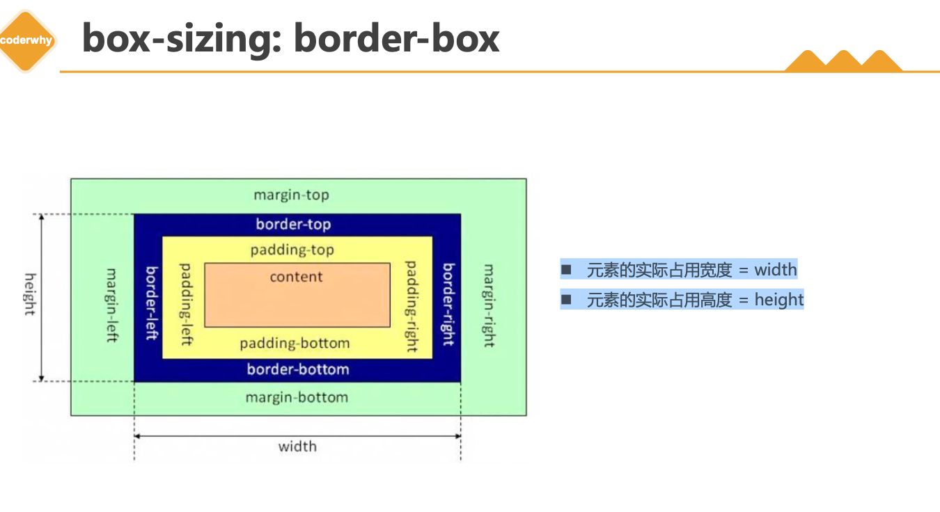
1.5. box-sizing
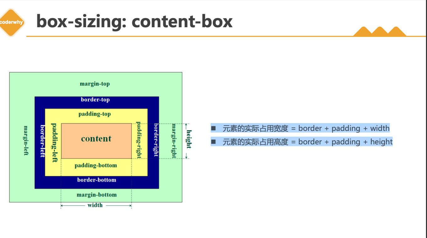
- content-box
- border-box(常用)
CSS属性 - box-sizing
box-sizing用来设置盒子模型中宽高的行为content-boxpadding、border都布置在width、height外边
border-boxpadding、border都布置在width、height里边
box-sizing: content-box
元素的实际占用宽度=border + padding + width元素的实际占用高度=border + padding + height
box-sizing: border-box
元素的实际占用宽度=width元素的实际占用高度=height
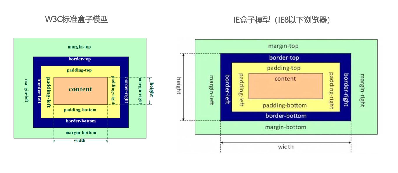
IE盒子模型
1.6. 注意事项
1 | |
1.7. 水平居中
1 | |
元素的水平居中方案
- 在一些需求中,需要元素在父元素中水平居中显示(父元素一般都是
块级元素、inline-block) - 行内级元素(包括
inline-block元素)- 水平居中:在父元素中设置
text-align: center
- 水平居中:在父元素中设置
- 块级元素
- 水平居中:
margin: 0 auto
- 水平居中:
二. 案例练习
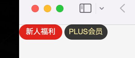
2.1. 京东小按钮
1 | |
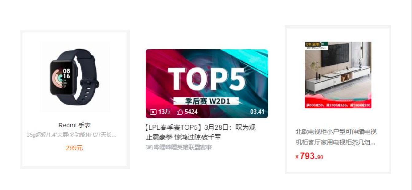
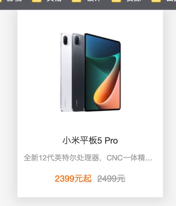
2.2. 小米的商品
1 | |
2.3. B站视频展示
1 | |
1 | |
三. 背景设置
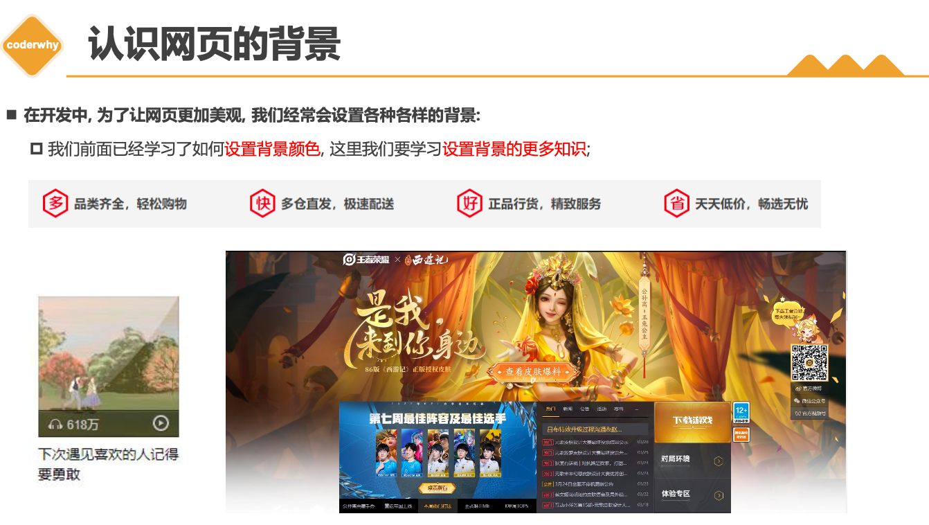
3.1. background-image
background-image用于设置元素的背景图片- 会盖在(不是覆盖)
background-color的上面
- 会盖在(不是覆盖)
如果设置了多张图片
- 设置的第一张图片将显示在最上面,其他图片按顺序层叠在下面
注意:如果设置了背景图片后,元素没有具体的宽高,背景图片是不会显示出来的
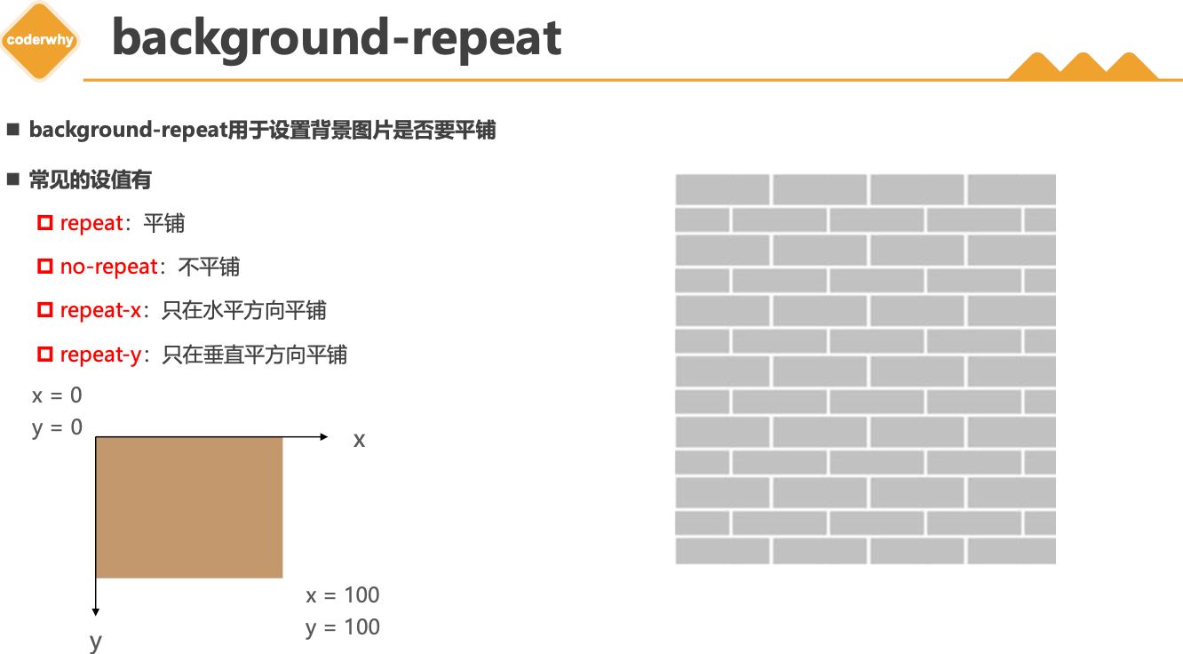
3.2. background-repeat
background-repeat用于设置背景图片是否要平铺- 常见的设值有
repeat:平铺no-repeat:不平铺repeat-x:只在水平方向平铺repeat-y:只在垂直平方向平铺
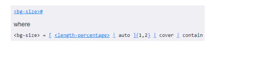
3.3. background-size
background-size用于设置背景图片的大小auto:默认值, 以背景图本身大小显示cover:缩放背景图,以完全覆盖铺满元素,可能背景图片部分看不见contain:缩放背景图,宽度或者高度铺满元素,但是图片保持宽高比<percentage>:百分比,相对于背景区(background positioning area)length:具体的大小,比如100px
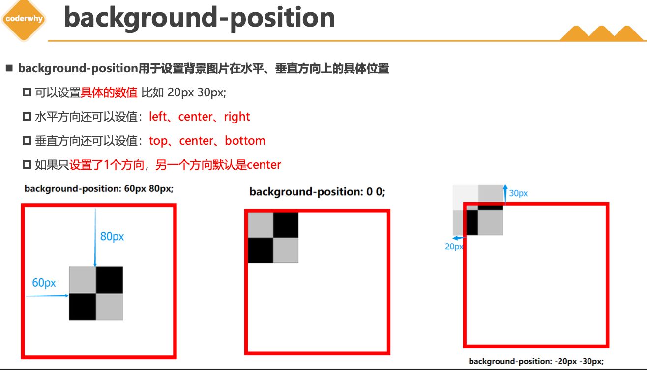
3.4. background-position
background-position用于设置背景图片在水平、垂直方向上的具体位置- 可以设置
具体的数值比如 20px 30px; - 水平方向还可以设值:
left、center、right - 垂直方向还可以设值:
top、center、bottom - 如果只
设置了1个方向,另一个方向默认是center
- 可以设置
3.5. background-attachment
background-attachment决定背景图像的位置是在视口内固定,或者随着包含它的区块滚动。- 可以设置以下3个值
scroll:此关键属性值表示背景相对于元素本身固定, 而不是随着它的内容滚动local:此关键属性值表示背景相对于元素的内容固定。如果一个元素拥有滚动机制,背景将会随着元素的内容滚动.fixed:此关键属性值表示背景相对于视口固定。即使一个元素拥有滚动机制,背景也不会随着元素的内容滚动。
3.6. background
background是一系列背景相关属性的简写属性
- 常用格式是
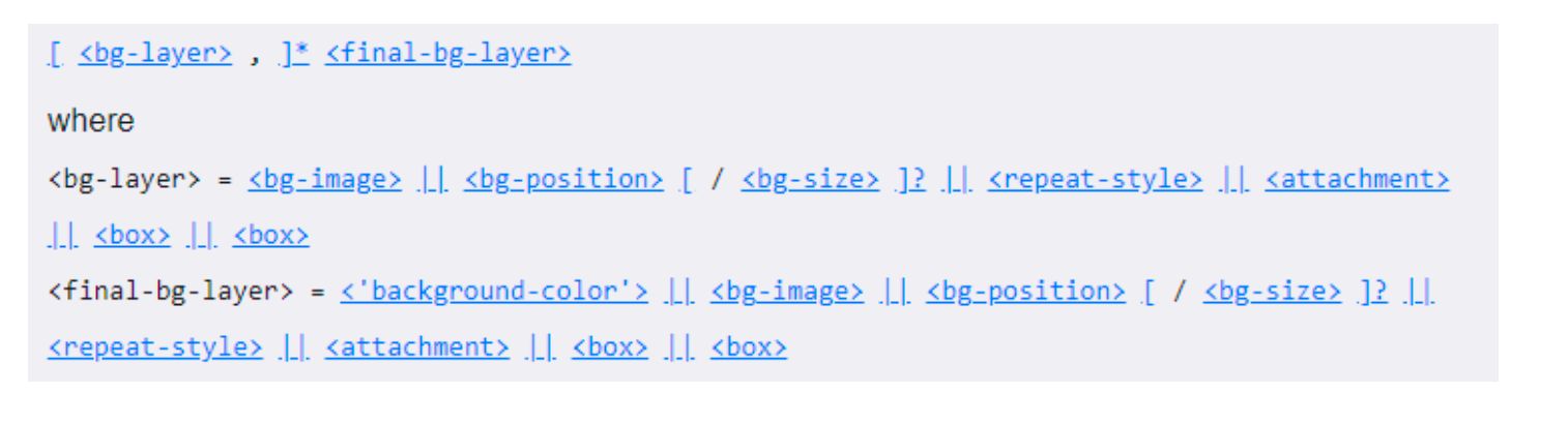
background-size可以省略,如果不省略,/background-size必须紧跟在background-position的后面其他属性也都可以省略,而且顺序任意
3.7. background-image和img区别和选择
- 利用
background-image和img都能够实现显示图片的需求,在开发中该如何选择?
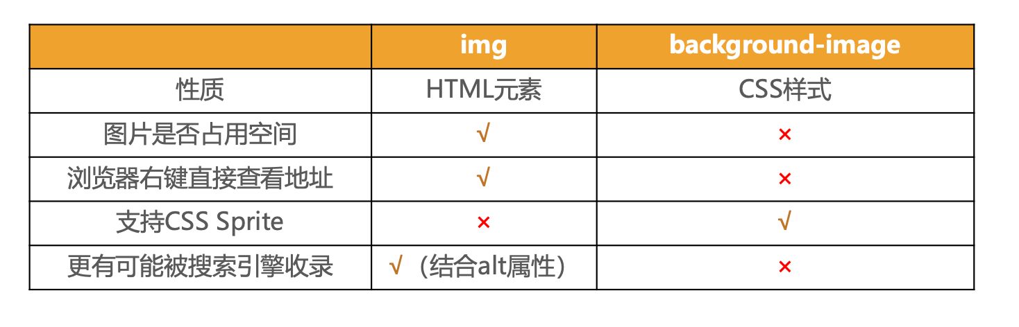
- 总结
img,作为网页内容的重要组成部分,比如广告图片、LOGO图片、文章配图、产品图片background-image,可有可无。有,能让网页更加美观。无,也不影响用户获取完整的网页内容信息
本博客所有文章除特别声明外,均采用 CC BY-NC-SA 4.0 许可协议。转载请注明来自 ZkeqのCoding日志!
相关推荐

评论